Do you ever wonder what's involved in creating a book cover? The answer is, it depends. My own experience has varied from having no involvement to being asked to choose costumes for the model, but rarely have I had the pleasure of watching the artist develop the cover and providing feedback each step of the way.
That's what happened with the cover for One Special Christmas. I was extremely fortunate to have gifted artist L.A. Sartor creating my cover.
It started with a brainstorming session in which we decided that rather than have my heroine in an exterior scene like the ones you see on most of my covers, since Greta was the manager of the tearoom in Sweetwater Crossing, we'd feature her in a tearoom.
At that point, all I told L.A. was that Greta was a blonde and that I thought a green gown would be good. After our discussion, I sent her this picture from the Christmas celebration at Fort Laramie, thinking she could incorporate it into her design.
While there's nothing wrong with this picture, it's a bit shall we say bland? L.A. recognized that and took a different approach. To say that I was overwhelmed when I saw her first design is an understatement.
I was thrilled! This was so much more detailed, so much more interesting than I'd expected. There were a few things that had to be fixed on this, but the overall design was more beautiful than I'd dared hope.Next came the choice of fonts for the title and my name as well as positioning of both. That took a few iterations, but we finally had a finished front cover.
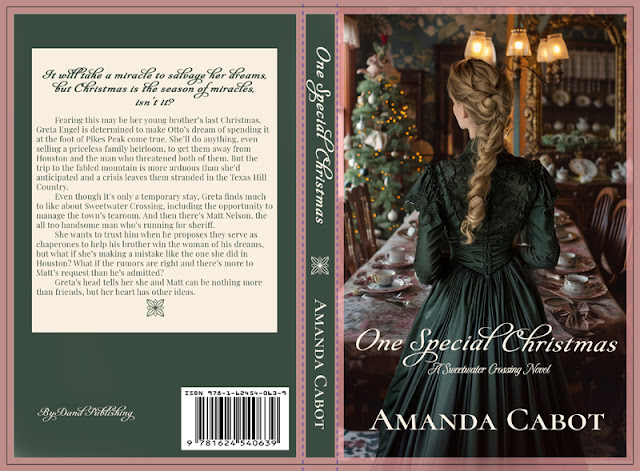
Next came the back cover. When L.A. asked me what I wanted, I suggested a green background with the back cover copy in a cream colored box. She probably knew that wasn't a good idea, but she let me see the flaws for myself.
There were many things wrong with this. Besides the fact that the teaser line is almost illegible, the back cover itself is too plain. There's nothing on it to make a reader want to buy the book. I'm famous for saying that back covers should be pretty. This one wasn't.
Fortunately, once again L.A. knew how to fix the problem. She created a tapestry for the background, and when we had an interactive meeting to finalize the design, we changed the spine color to rose.
What a difference! We now had a full cover that I loved. The back cover is more than pretty. It's beautiful, just as the front cover is.
I'm thrilled with the way it turned out and hope you agree with me that this is an outstanding cover.
If you'd like more information about One Special Christmas, you can find that as well as an excerpt on my website.
And if you enjoy cozy mysteries, you won't want to miss L.A.'s Tick Tock Dead. Yes, L.A. Sartor is not only a gifted artist, she's also an author. Here's a link to her website.


When two gifted people combine their efforts it's simply amazing at what they can create! Beautiful work on both counts. Congratulations LA and Amanda. Cheers
ReplyDeleteThe first back and front cover look wonderful, but they droop when compared to the second. Only experts - true graphic designers - have "the eye" for what is really striking.
ReplyDelete