So many of you have told me how much you enjoy learning about the process involved in developing the wonderful covers that Revell has given me for each of my books, that -- as I promised last year -- I'm continuing to blog about them.
As is always the case, many people are involved in turning a concept into the final product, but the biggest responsibilities fall on the Art Director, Cheryl VanAndel, and the graphic designer, Dan Thornberg of Design Source Creative Services.
This time, the process included a step that I hadn't seen before, namely the creation of a cover sketch.
As you can see, it resembles the finished cover, but the model and her costume are very different. Why create a sketch at all? The reason, Cheryl explained, is to allow Revell to select the model's pose and placement prior to the photo shoot, thus streamlining the process.
One of the most important elements in my covers is the model. After all, she represents my heroine. Thea Mills is 27 years old, shorter than average, and has blonde hair, brown eyes, and a medium build. She's deeply compassionate but also fearful of having her secret revealed.
Knowing that, Revell chose Emily.
Even though you're seeing her in modern dress here, isn't it amazing how well she captures Thea's personality?
Next comes costume selection, which I freely admit is one of my favorite parts of the process, since I'm part of it.
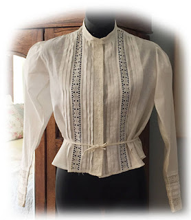
Cheryl gave me a choice of more than half a dozen different blouses including the following:
None of those truly appealed to me, but when I saw the next one, I knew it would be perfect. In addition to its antique look, I loved the fact that it was a complete outfit and that we wouldn't have to find a coordinating skirt.
At this point, everything was ready for the photo shoot.
While the cover sketch identified one possible pose, Dan photographed Emily in several different ones.
Do you like this one?
Cheryl told me it was a top contender for the cover, but the committee preferred the next one.
I agree with them that the second pose is better for the book, in part because it emphasizes Thea's medical bag and gives a hint to her career as a midwife.
If you compare this to the final cover, you'll see that the pose is the same, but there's a big difference. Did you find it? Yes, Emily's expression is different.
Thanks to the marvels of Photoshop, Dan was able to use the head from the following picture with the body from the previous one.
The photo shoot was complete.
The model is one of the most important elements of the cover, but she's not the only one. The background is also key to setting the scene for the book and giving readers a hint about the story itself.
As is often the case, Dan used stock art for the background, starting with Thea's home in Cimarron Creek.
Don't you wish you lived in a house like this? It's beautiful, but there are a few problems, including the streetlights. Those had to be removed. And then there was the water. While it's lovely and you might believe it was Cimarron Creek itself, the creek doesn't flow through that part of the town.
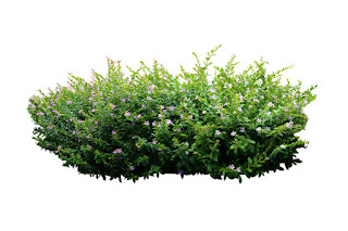
What to do? Dan used flowers that might have been growing in the Hill Country to block the water.
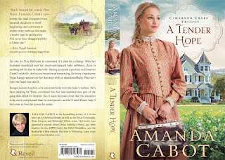
And so we have the final cover, the one I showed you at the beginning of this post.
But the front cover is only part of the whole book. The back cover is almost as important, because that's where readers learn about the story. And the spine is critical for bookstores, since few of their books are shelved face-out.
As you might expect, given the attention that Cheryl and Dan put into the front cover, a lot of work was involved in the back cover too. Writing back cover copy is an art in itself. Fortunately, Revell has extremely talented writers who specialize in condensing a 95,000 word story into a few words. And the addition of a western picture as a cameo adds to the appeal ... at least it does for me.
I was thrilled with the cover and hope it piques your interest and makes you want to read the book.
If you'd like more information about A Tender Hope, you'll find it and buying links on my web page.
And, of course, I hope you enjoyed learning more about the cover art process. It never fails to intrigue me.


So interesting and fun. Thank you for sharing.
ReplyDeleteBonnie, I'm so glad you enjoyed the post. These are my favorite ones to write.
DeleteLovely the covers are usually what makes me want to read the book. Thank you for sharing. I do enjoy all that you write for the public
ReplyDeleteLori -- It's true that covers are the first thing that attract us. Even though we've all heard, "Don't judge a book by the cover," I know that I make my decisions about books based on the author first and then the cover.
DeleteFascinating stuff. It's wonderful they take so much time and consideration in designing your covers.
ReplyDeleteRevell doesn't take shortcuts, and that shows in the final product, doesn't it?
DeleteThat was so interesting.
ReplyDeleteI'm glad you thought so, Virginia.
DeleteSuch a process! I'm surprised some publishing houses still create covers using real models. Good for them! I love the finished product, and now, I can't wait to read the book!
ReplyDeleteReal models and photo shoots are expensive, but the result is a one-of-a-kind cover. I love the fact that I won't see my cover design anywhere else, and -- while I may be prejudiced -- I think Revell's covers are the best in the industry.
DeleteWhat a fascinating process! I can see why it's so important, but I hadn't thought about the spine art also being important. Thanks for the explanation and photos.
ReplyDeleteSusie -- Although every author hopes her books will be displayed face-out in the brick and mortar stores, that doesn't always happen, so spine art may be the only thing to attract a reader. I've been very pleased with the spine art on all of my books, but -- as I've said before -- Revell does an outstanding job on their covers.
DeleteNice post, Amanda. I enjoyed going through the process with you and the Revell team. I've had input with my book covers, but not with so much detail as you have here. Maybe I will do a cover post about my new cover. I worked with a different person at Revell after working with Cheryl on many lovely covers. But Gayle did a great job with the new cover for The Refuge too. Your new cover is lovely. Very eye-catching. The two of us seem to have something of a same thought wave with the midwife.
ReplyDeleteAnn -- I hope you will blog about your cover, because I'd love to see whether the process was different from mine.
DeleteWow, Amanda, what a process. You have a superb publisher and art department. But then, you're a superb writer. Thanks for sharing it all with us. Cheers
ReplyDeleteMarilyn -- Thanks for the kind words about both the post and my writing. Great covers in addition to superb editing and outstanding marketing are among the many reasons I'm grateful to be a Revell author.
DeleteThank you for sharing this link with me. I love hearing about the whole process. You have a gorgeous cover and I see that there is a LOT of behind the scenes work on those beauties.
ReplyDeleteperrianne(DOT)askew(AT)me(DOT)com
Perrianne Askew
Perrianne -- I'm so glad you enjoyed seeing some of what's involved in developing a cover. I'm always fascinated by the process.
Delete